Click here to download this week's dataset as a CSV
Click here to download this week's dataset as a Hyper Extract
Data Storytelling
There were several different metrics to choose from in this dataset, and I initially struggled with which to choose. Instead of focusing on one particular metric, I decided to make a pretty generic viz that would cater to whatever metric the user wanted to look at. I thought about comparing the metrics, but without converting the unit of measures, some of those comparisons would be meaningless.
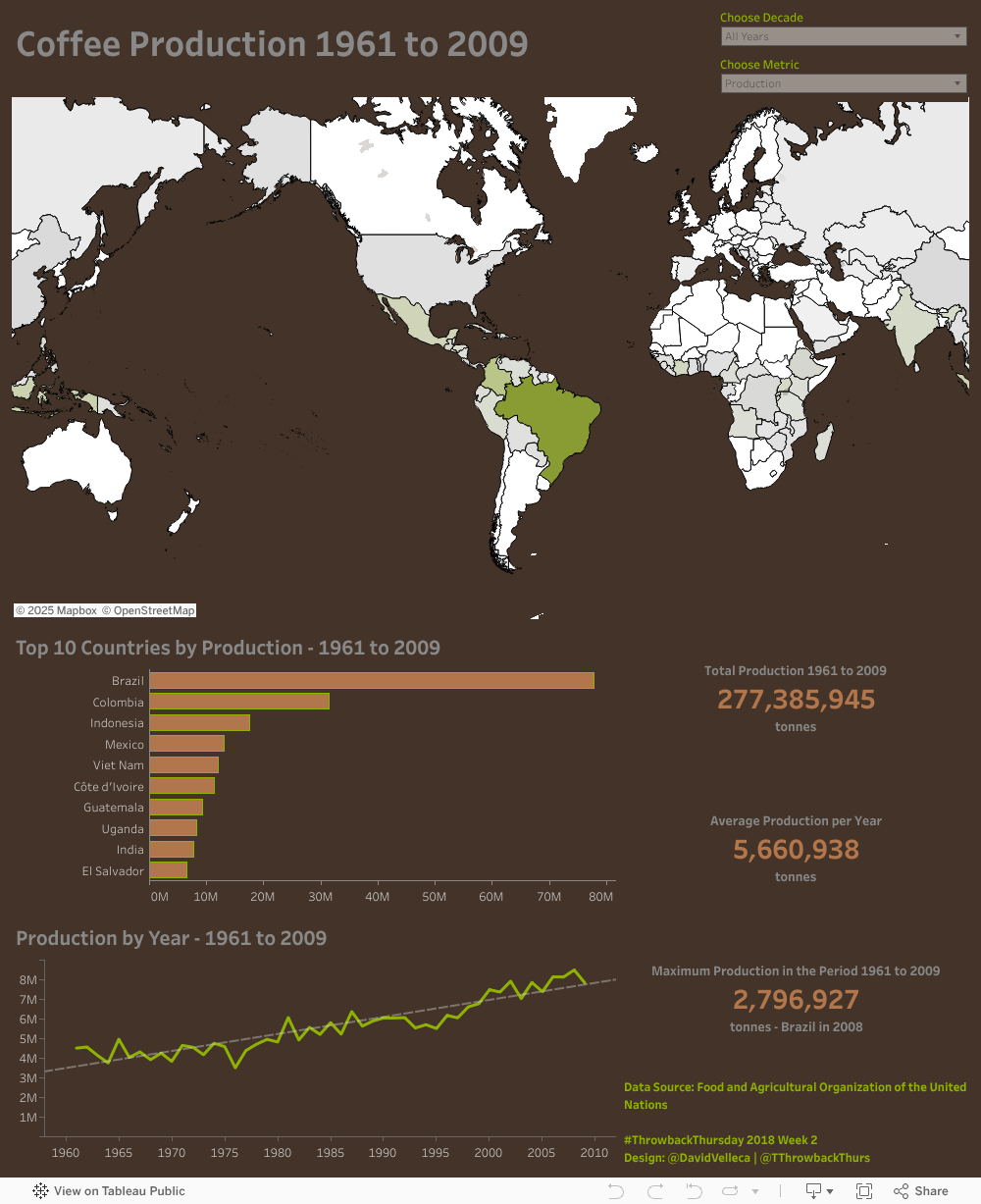
I was able to find some interesting insight in the data. Despite being number one for green coffee bean production, Brazil has surprisingly low yields. Countries like the United States and China have much higher yields. This is likely due to technological advancements that Brazil is not able to take advantage of. There are other insights in the data, such as Germany being the second largest importer of coffee behind the US, or that imports for the US are trending downward (while production is trending up for the full time period).
Data Viz Approach
For this dataset, I wanted to be able to show trends over time, the comparison of metrics by country and the geographic distribution by country. I used a standard line graph by year to show the trending of the chosen metric over time, enhanced by a viz in tooltip that shows the top 10 countries for the year that the user is hovering over. For the comparison by country, I used a bar graph for the top 10 countries by chosen metric. I employed a line graph similar to the trend over time as a viz in tooltip. For the geographic distribution, I used a chloropleth map at the country level (the only available granularity in the data). The background map was created in Mapbox to help me match the custom palette for the overall visualization.
Calculated Fields
Nothing too crazy this week. I built a few parameters to drive the interactivity, which required some calculated fields. The first was the parameter for choosing the displayed metric. Based on the user’s selection, I needed calculated fields to drive the proper metric, unit of measure and other tooltip specific text. The parameter for time frame drove some calculated tool tip text as well as a filter calculation.